Monday, April 26, 2010

Roof Exercise - Final Model


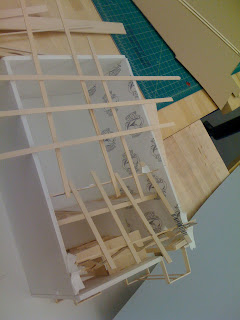
Attached above are pictures of my 1/4" final roof model. I decided to divide my wall into three different parts. In each part, I played with a different roofing idea. Overall, I'm very happy with the final result of my work. The flexibility of this quick assignment let me explore a lot of ideas in a short span of time, which I think led to a very unique roof design. Once again, I see how modeling offers increased opportunities to develop designs that would be hard to imagine on paper.

The first 15' uses repetition with variation of trapezoidal forms. The purpose of this was to create a change in height, as defined in the program, while also guiding entrance into the building with an overhang. I think the angles created by these forms created a unique aesthetic that changes as one moves around the building.

The middle 20' of the roofing scheme utilizes Fehn-like beams in radiating patterns. The Little Sports Palace roof design by Nervi inspired this part of my roof. I wanted to create unique roof patterns, while leaving this part of the community center open to the elements. This type of roof allowed me to frame the trees effectively, but also it leads to many unique light patterns throughout the day.

Last, I played with a Pinos roof for the last 10' of the roof. In retrospect, I agree with some of the comments from class. This section of the roof does lack connection to the rest of the roof, and it doesn't show as much creativity. My goal for this part of the roof was to offer a covered space in the back of the building that clearly stood apart from the openness in the middle of the building. Also, I liked the side view created by the triangular Pinos design. However, it seems that the Pinos roof looks far more appealing from the interior than the exterior.

Sunday, April 25, 2010

Cool chapel


Here's one cool chapel (The Chapel of the Holy Cross in Sedona) that my mom had actually visited and recommended! I love the way the cross is both used as a structural support of the window, is a skeletal contrast to the main building mass, and is embedded into the rocky base.

Wednesday, April 21, 2010

I really wanted my roof design to serve as a sort of hybrid between both the Fehn and the Pinos systems in a way that allowed them each to function separately, and yet work well together as one roofing system. I first played with the Pinos system--accordion-folding different sized pieces of mat-board and arranging them in a pattern that I found aesthetically pleasing and also that worked with the location of the trees along the roof.


As one enters the building, these Pinos structures work to draw them into the building and towards the trees. By intersecting these folded beams with simple straight Fehn beams, I sought to use the roof as a way to divide the building's interior space. Thus, upon entering the building, you automatically enter a gridded space created by the folds and intersections of the roof beams.


Also, by positioning these beams on the underside of a flat roof, I hoped to create a sense of interior depth.

Final Roof Model


In my final model, I built upon my quick study model and started with the trusses that dipped lower and lower into the building itself on one side and peaked higher and higher on the opposing outer side. I liked this complement between the outside and inside of the roof and thought that it would be interesting for the people inside to be able to see such a great change in roof level when standing at different points of the building. I felt that it would be interesting to add a horizontal component to the roof which already had a strong vertical language, so I added in a sequence of fehn-like beams with graduation in length to both the outer and inner side of the roof, in opposition to the peaks of the trusses. I like the effect that this addition achieved. I feel that the two components create a sense of symmetry that is interesting because of the repetition and variation of the trusses and beams.

Tuesday, April 20, 2010

Final Post for Roof Assignment


Here are some picture of the Arbel's and my final roof assignment. We were inspired by the clean grid of the Fehn roof. But since we had this not too large, not too small space, we felt we had more leeway than just the straight up grid. So we decided to create a not-so-uniform grid. Then we got the idea that we can pop that not-so-uniform grid out in more than one dimension.

Our system moves from simple to complex, a totally philosophically based move, not serendipity, you know. But, actually, we did notice as we were gluing that these tiles were drying in a pretty wonky fashion which could be fixed by holding the tiles in the exact spot we wanted them in as they dried. But, we made the conscious decision that the gradual movement of wonky to static (for loss of better word)worked well with our philosophy behind our design.

If given another iteration, I probably would vary the materials of the tiles. And, probably look at breaking the boundary of the wall--eg, we originally talked about tiles sticking into the walls/coming out of the walls.

We're quite pleased with the result especially since we can see how our system interacts with light through the photographer's light we used in our pictures.

Final Roof

Roof Project.

Initially I was thinking of doing something pinos model and came up with some segments, not really comprising a whole roof, but just to get some ideas. I also looked at some truss ideas that could span along the 30 ft span. From there I kind of got an idea to combine them somehow to make the final roof.
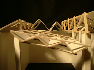
The roof consists of two trusses that span along the 45 ft span and are supported by the wall and columns in the front. The right hand truss is taller to give some variation between the two trusses. Since the trusses have a triangular shape with the roof covering to the sides, I thought the pinos type roof could easily mesh with the triangular forms.

The back middle part is in contrast with the front pinos system. The back system drives up with fewer peaks, while the front slants down with smaller more-frequent peaks. Something cool about the front pinos system is that it is suspended from the truss. The middle space provides room for the trees in the community center.

Monday, April 19, 2010

FInal Roof Post


Here are some images of my final roof. My design for the roof evolved from what I had played around with in class. I really wanted to keep my roof simple and try to incorporate some of the things we learned about through the powerpoints. I wanted to incorporate the Fehn roofing style and thought a lot about how light would enter the room and cast patterns on the floor. My roof is inclined at the top and I thought this would be an interesting way to let light in. create an interesting facade and change the elevation. I used my proportion of thirds (the first third is the inclined portion) The remaining two thirds of the roof is my interpretation of the Fehn style, with the criss-crossed pattern of beams. I also added another layer on top of the Fehn system to create interesting patterns of light on the floor. This also was inspired for the layering I explored in the wall project we just completed.

Roof Exercise - Inspiration


Attached above is a picture of The Little Sports Palace in Rome, Italy. The design is by Pier Luigi Nervi. The roof of the sports arena utilizes a ribbed dome of reinforced concrete to create a powerful visual aesthetic. I wanted the center of my roof, surrounding the trees, to form unique patterns. However, I want to allow more light into my building, so I tried to create a roof similar to a Fehn roof. This type of roof system enabled me to create unique patterns, while also offering differing views and light patterns throughout the day. You should be able to see how the middle of my final roof design resembles this arena design by Nervi.

Roof Exercise - In Process


Attached above is a picture of my in process 1/4" study model for the roof assignment. At first, I tried to incorporate my wall design into my roof design. However, I've since chosen to design my roof without consideration for my previous wall design. I felt like an entirely new design would give me more room for trying out new ideas. My final model has evolved a lot since this model, but the radiating beams in the center are still present. A main goal for me was to allow a lot of light into the community center surrounding the trees. Also, I tried to come up with a design that would create unique light patterns throughout the day. I look forward to hearing everyone's comments today in class.

Sunday, April 18, 2010

In-process roof


Here are in-process ideas for my roof. I want to create an exciting experience for the people inside the community experience, so I'm experimenting with using varying heights of roof that hang down with a gradation. I'm thinking of adding trusses and perhaps mirroring the effect inside the community center on the upper side of the roof, so that the roof structure dips into the community center, then rises in a peak.

final roof exercise post


First, since I knew that quality of crafting wasn’t a requirement for the project, I conceptualized it as a sort of community-driven, community-executed volunteer project that involved maximizing utility within the constraints of a limited budget, limited materials, and perhaps limited craftsmanship (due to civilian participation).

I wanted to do use a different design than the one I used for the Wall Assignment, but I wanted to adhere to the same fundamental principles: minimalism and proportions of three. I wanted to fulfill the program demand – to produce a roof with a space for trees – while letting in ample light and creating a structure that was both functional and structural. I also wanted to incorporate changes based off of the critiques I received for the Wall Assignment, so I really tried to get all of the elements within a single proportional framework. I ended up creating a system of planes and then supporting them with a truss-like system made of tetrahedron-shapes.

The beams in the truss are meant to create an overhead open-ceiling space where the bare structure is visible – I like the minimalist aesthetic that makes structural aspects attractive. The hole in the third panel is very simple but practical and highlights the trees while minimizing room space that is exposed to weather.

cameron


Saturday, April 17, 2010

Roof Exercise


Here are some pictures of mine and Ari’s roof exercise. The gap in the ceiling is where the trees are meant to come out of. Our original inspiration was the Sverre Fehn model: we both found the grid idea for the roof very attractive. But then we started thinking more loosely about how it would be interesting if each square in the grid was actually a tile. Finally we began thinking about how it would be interesting if these tiles hung from the beams at the top at different heights and overlapped a little.

We used Balsa wood dowels for the beams and hung our panels off of these with paper clips. Our initial challenge was that in plan view, the panels didn’t really want to hang in perpendicular or parallel fashion (they were all hanging at weird angels to each other). Eventually we fixed this by super gluing the paper clips in place. In elevation view they hang at strange angles sometimes but we liked this effect and decided it shouldn’t be “fixed.”

-Ari and Arbel

Friday, April 16, 2010

In-process roof exercise


Here is an in-process photo of the roof exercise.
c

Thursday, April 15, 2010

In-Process Roof


During yesterday's class, it was hard for me to just jump into building without doing any drawing first, but it was great once I got into it and could actually see a rough outline of my ideas in material form! For my roof, I played with building a butterfly roof that would slope down to where the trees would poke out of the building. I think this will be a good way to let light in. I then want to explore the Fehn style of roofing (although I am also trying to think of how I can incorporate both forms we looked at in class).

Wednesday, April 14, 2010

In Progress Roof Project

For my roof project, I was primarily inspired by Pino's system and through that began to cut and accordion-fold strips of matt-board. Once I had several strips of matt-board accordion-folded, I arranged them in a way I found aesthetically interesting and that also formed a unique area through which to frame the courtyard's trees. Here is what I have so far!


Final Wall Model

My final wall model was still based of the rule of thirds. It moves from a direct translation of that proportion on the left with the wall of opaque glass, clear glass, and cement. That is, each piece of material sits on a grid based on thirds--I divided the 30' wall in 10' segments and then further divided it into thirds and so on and those dimensions defined how the different materials intersected and how the different materials were individually shaped. This simple design then fed into the cube interaction on the far right as a manifestation of idea of simple to complex. I also played with the idea of skeletal versus mass in this area as shown by the skeletal structure of the interior habitable space and the solid flipped cube that houses the zen view.

I really wanted to emphasize the journey so I expanded the idea I had going on in the paper model. I made it more ordered by setting an exact progression and framing each "square" in an pattern.

With all the interesting angles I had going on, I had plenty of opportunities to play with light. I was especially pleased with the way the passage way turned out. I really liked the mix of light yielded by the chipboard, acetate, and tracing paper. I felt that it really conveyed the idea of a journey as the passage itself starts at 8', goes to 10' in a sitting area, and ends at 8' at the entrance of the community center.

I realize that this was a very complex model given the first project and given the assignment but I feel it accurately portrayed, in a way paper could never have done, my idea.

...And the add-the-picture icon on this interface seems to refuse to work still. Any ideas? It has been doing this for quite some time...

My Final Wall

Hey guys, I apologize for the late posting of my in-progress wall, I had quite some complications in acquiring a camera, surprisingly. The first picture is one of the first models I brought to class. Confusing and chaotic, I was surprised that I stayed--somewhat--in this initial design. I was really focused on the relationship of skeletal versus mass as well as the idea of staggering. Staggering was a more subtle theme I tried to introduce. The initial idea of habitable space, which was not quite clear in this model, was to create different layers of space within the wall. That is, I had stairs on the back of the right hand side of the wall which led to what was hopefully two/three (probably two) platforms embedded in the wall for visitors to sit and take in the view. And, I had tried to plan these platforms such that the second/third one (above the doorway that cut off the left hand side corner) would be totally exposed to both the community center and the outside world. Of course, with the actual size of the wall, this was an impossible and thinking back on it, a little ludicrous.

The wall was divided in the rule of thirds, popular in any basic photography class. I used this proportion because I wanted to create a unique zen view by using my (then) triangles' meeting points as some kind of angled window.

However, over the course of the assignment, I scrapped idea of the triangles. I went ahead to build a 1/4" scale of a wall out of paper. Well, it was more of a model of what my favorite part of a wall would be. And that was the journey. I built this skeletal hallway of 8' and 10' squares gradually increasing in height until the sitting space then decreasing back to normal until the community center. This really helped me to play with my ideas since I soon got fed up with lopsided, weird 3D shapes on paper.

Hmmm...the blog does not seem to want to let me post my hard earned pictures. I promise they will be up soon since it took so long to take them.

Final Model


In my final model I played with the idea of mass vs skeletal by having the frame poke out from the corner of the model. This also served as a zen view. I decided to make the frame's scale different from the model scale because I figured the easiest way to build a frame would be in 5x5 ft sections. Since the corner that is cut out is 9x9, the frame appears a little asymmetrical--which is something I liked.
I had open slits in the plan of the inside wall so that light would shine into the intruding squares. On the outside wall the squares extrude out rather than intrude in, making shadows and lighting a big part of both the inner wall and the outer wall.
I used layering to make the model interesting since the walls were already so thick, and also in order to create a habitable space.
The pattern that kept re-0ccurring in my model is that idea of the 2 rectangles with one rectangle below. I brought this into the habitable space to create windows and a place to sit in. I used the theme of the 9x7 rectangles to create a bookshelf in the habitable space.
As you can tell, my original model and final model are very different-I was really pleased with the outcome!

Wall Assignment - Final Model


Attached above are an interior and exterior picture of my 1/4" final model for the wall assignment. In this model, I used the repetition of triangular forms to create a unique aesthetic that I find far more striking than my initial study model. I think my additions allowed me to move past a simple planar wall to a complex wall with much more vibrance and depth. The right side of my wall still bares resemblance to my earlier models in the sense that it makes use of a proportional grid to provide changing glimpses of the trees and forms within the community center.

The layout of my wall design focuses on satisfying the program requirements as set out by the client. I used different materials for windows and skylights in order to provide a mix of both transparent and translucent. Also, I tried to place windows accordingly, so that the habitable area wouldn't be too bright from light exposure. Next, I used the positioning of elements within my wall to guide circulation into the building. This allowed for entrance into the building to be a slow journey that might build anticipation for the trees within. The layout also guides people to the diving board shaped, tree overlook (zen view) and the habitable area, where bookshelves and seating benches are located. Although I state that the overlook is my main zen view, I wanted the the combination of window placement and triangular forms to offer unique views from many angles.

Overall, I am pleased with the progression I made from my study models to my final model. I now recognize the value of 3D modeling, as opposed to simple 2D sketching. My playful use of triangles and the final appearance of my model resulted directly from modeling. I feel like my modeling abilities have room for improvement, but this was definitely a good starting point for the class and I look forward to later assignments.

Final Wall Model

This is my final wall model. To give both a sense of unity and interest to the wall, I used repetition of vertical lines, whether it be the skeletal structure or the extruding vertical strips on the wall. To make the repetition more interesting, I used variation of the width of the vertical elements (the width and spacing of the skeletal structures made of balsa wood in the model are half that of the vertical columns on the wall). Additive and subtractive elements are apparent in the glass windows. The glass windows are arranged in an ascending order, and the window at the bottom juts out of the building, allowing people to walk out a bit further from the building itself and enjoy the view outside. This is part of the habitable space, the area on the raised platform, which serves as a cozy nook for visitors to sit down, relax, and read. The middle window pane is positioned in the same plane as the walls, and the uppermost window juts into the building. The windows' gradation in terms of height and depth invite visitors to slow down their pace and appreciate this variation in the architecture.


The entrance to the community center is located on the far right when facing the wall. Upon entering, the visitor is directed by the wooden skeletal structures to travel diagonally towards the cluster of trees in the middle. Among the cluster of trees is a pattern on the floor, distinct from the rest of surrounding area, which catches the visitor's attention. The visitor looks around, curious about whether this change in flooring signifies anything, and a small window at the top of the wall catches his/her eye. This is the zen view. The visitor can look up and catch glimpses of the trees outside and the sunlight that filters in through the opening makes interesting patterns on the floor. At the same time, visitors walking toward the building can catch glimpses of the trees within the building when they look up through the window.


The visitor now sees the habitable space, which is on a raised platform on the side of the wall with the additive/subtractive windows. The upper part of the bottom window is translucent and filters the amount of sunlight that enters. There is a ledge that juts out from the bottom window's structure, which people can sit on. Around the windows are benches and a bookcase. The habitable space is partitioned off by a thick wall with a glass pattern on the upper half, through which you can see the windows behind it. The glass panel uses a shape that fits with the theme of the windows, and this use of layering intrigues the visitor to enter and explore the habitable space. On the side of the partition facing the habitable space, there is a screen door that can be swung open to create a greater sense of privacy in the habitable space and shield its users from the eyes of casual passersby.


Final Wall Post

So for my final project, I sort of stuck with a symmetrical proportion. Horizontally this was 3-2-3-4-3-2-3 and the vertical grid was 3-6-3-1.5-3-9-4.5. The idea with the vertical proportion was to add variation to it, so the left 9-4.5 is 1.5 of the right end of the grid. The Zen view in this wall occurs as one is entering the community centers. the panels sticking out of the walls block the view of the tree branches in the area near the entrance of the wall. As one walks in, there is a gap between the two innermost panels in the entrance that allow a view of the trees through a clear window section.
The habitable space is located on the right side of the wall. The area was not to be abundant in light, so there were two horizontal window panels consisting of both transparent and translucent windows, the small translucent window in the bottom panel can be moved to change light setting at close proximity. Another cool feature is that light also comes from the sides which is less expected.

Subtractive was probably the most used method and is predominantly used. Adding could be seen by the triangular mass sections that stick into the courtyard between the tower and the entrance. I also tried to use mass vs skeletal with a skeletal tower contrasted with a massive wall next to it, and an interplay of massive and skeletal in the door way and right part with walls with a series of layers horizontal wooden panels. The extra manipulation that i attempted was layering. This however was done up to down instead of in depth. The wall on the right is made with layered members instead of a straight panel. The right side of the wall has a layer consisting of an interchange between mass and wood from top to bottom. These panels also work as bookshelves in the inside of the building, and the top panels become a sort of canopy for the habitable area.