Sunday, February 28, 2010
I have a roof/lighting sysem
Unfortunately [but really, it's hard to tell what the good news and what the bad news is.], it's just a system. Now that I am sure I can find way to use the system in a manner which I will, in the end, find pleasing/satisfactory, I've moved on to the walls.
I feel like the marrige of the two system will give me a more rich texturing than if I make a final roofing system then make walls to hold it up.
Here are the pictures of the exploration that led me to the roof/light entry system.
The first image is with foam core at 1/2 inch, the holes being about 1.25' at scale.
This second image gives a sense of the light quality. The overlapping boxes give a range of shadows.
Thinking of shadows as negative views of the sky (heavy shadow means a largely obstructed view) one can imagine from this picture that, as one moves beneath this canopy (very literal perspective shifts) the parallax of the grids at different distance will create and destroy spaces as the viewer moves around.
"The movement of the body as it crosses though overlapping perspectives formed within spaces is the elemental connection between ourselves and architecture."
-Steven Holl, from Parallax.
This is a top down view of the 1/4 inch model.
Suggestions included ordering the smaller cubes in a more intentional fashion, aiming for a phenomena rather than mathematics.
Also giving the top grid more depth (6" instead of the 3" I have in this picture).
This is the view from the altar area, in this scheme. There is less between the viewer and the sky.
Here are the shadows cast by the rotated cubes.
Next for the roof system:
Translucent portions. Clear portions. Unglazed portions. Solid portions.
My aim will be to bring light and space into the chapel. To blend the inside with the outside whatever the weather, but in such a way that each set of circumstances leads to a different melding. I believe I can do this (although I doubt it will be all together successful this first attempt) by having some cubes penetrate the chapel, with their undersides glazed but their tops open, while other will have the opposite treatment. To capture sunlight, there has been talk around the office of filling one of the cubes with a bunch of shiny metal, much like at MIT.
There may also be a solid cube of glass, or one that is made out of may layers of glass, as that one wall.
"As individual element blur, the overall enmeshed experience approaches the strange and transcendent."
-Holl, Parallax
I'm altogether excited.
Saturday, February 27, 2010
Inspiration - Novy Dvur
The Novy Dvur monastery in the Czech Republic, by the British architect John Pawson. I am inspired by how the very simple lines and shapes can create a holy space. The light inside the main space is subtle and bold at the same time and gives a feeling of balance and peace to anyone inside.
Note: I have also blogged about this for an art class.
Friday, February 26, 2010
process
For this project, I chose to have a simpler design (in contrast to my wall project) that corresponds with my last post. Therefore, my chapel's design intentions are not to impress (Forms will be mostly functional, and minimum intricate designs) but to through experiencing the inside/circulation paths
My 1st study mass model showing the box forms, so that I start out very simple, easy to fix later.
I then received advise to make the corridor (a quiet darker pathway guided by soft light between the roof and the other wall, leading to a framed ocean view) very interesting/welcoming for people, because here is where the enlightening moment is experienced. A peaceful walk, ending in a very bright zen room/entrance to the chapel, with the ocean view to uplift the person, after a semi-gloomy walk, guided by soft light and the view of the ocean. This version also gave me challenges, for example I cannot seem to know where to place the lobby, without it being (1) hidden, (2) blocking circulation, (3) not enough space for a small gathering. For now I left it as an optional lobby, where you can enter to wait for people, and also a glance to the ocean view. Also, I am worried about the roof system for that small pathway created.
I am currently working on resolving these problems.
My 1st study mass model showing the box forms, so that I start out very simple, easy to fix later.
I then received advise to make the corridor (a quiet darker pathway guided by soft light between the roof and the other wall, leading to a framed ocean view) very interesting/welcoming for people, because here is where the enlightening moment is experienced. A peaceful walk, ending in a very bright zen room/entrance to the chapel, with the ocean view to uplift the person, after a semi-gloomy walk, guided by soft light and the view of the ocean. This version also gave me challenges, for example I cannot seem to know where to place the lobby, without it being (1) hidden, (2) blocking circulation, (3) not enough space for a small gathering. For now I left it as an optional lobby, where you can enter to wait for people, and also a glance to the ocean view. Also, I am worried about the roof system for that small pathway created.
I am currently working on resolving these problems.
Quarter Inch Study Model
Photos taken today after class. The critics brought up some good issues dealing with hierarchy and expressive light, so I will be resolving these problems this weekend.
The above image shows the effect of a cast 'cross' on the inside wall of the tower.
The above image shows the front of the triangular chapel. The two glass planes are currently just translucent panels, but I will add some strips of clear glass to allow guest on the second floor to view the ocean.
Thursday, February 25, 2010
Client-Preferred Architect Inspirations
Three of the client's preferred architects that I drew inspiration from were Carlo Scarpa, Sverre Fehn, and Tadao Ando. The areas of inspiration, respectively, were massing, material, and light expression.
The above building by Scarpa illustrates the beauty of a complex interlocking of geometric objects and acute angles. A few critics have suggested that my structure is too complex and relies too heavily on a variety of materials, but Scarpa's work demonstrates how a thoughtful ordering and placement of these massing objects, wall thicknesses, and glass can create a very strong sense of balance and interaction. While most angled corners of my building open up to circulation, there are some at the outermost edges of my structures that are difficult to inhabit, so I may use them as storage or an interesting expression of light.
The above building by Fehn illustrates the use of a powerful form of translucency on vertical walls. It is characterized by horizontal slits of glass which block vision into or out of the building, but allow a controlled amount of light through the plane, both during day and night. I plan to use a similar material and texture on my light boxes, which connect to all buildings and are the main channels of light into and out of the structure. A juxtaposition of this kind of translucent wall and clear glass panels will also allow for interested framing.
Finally, the above building by Tadao Ando illustrates the power of thin slits of light to create meaningful expression of light, in this case a vertical cross in the Chapel of Light. I plan to use a similar cross shape on the roofs of my tower. This has benefits over Ando's design because the direct light beam will not cause problems of glare in the long shaft of the roof, and the horizontal crosses will cast long crosses, either in light or shadow, on the vertical walls of the towers, moving from wall to wall during the course of the day.
Updated Chapel Sketchup Model
This is an updated model on Sketchup which shows some exploration of materials of walls and the perforations of the light boxes. The initial model was based on a vertical proportion of 8 ft, but I decided to increase that proportion to 10 ft to allow for more volume within the structure, bringing the height of the two wooden towers to 30 ft.
The triangular main chapel still needs work in terms of the ultimate structure of the glass walls and the roof/ceiling. Because there are two levels two the chapel, I have a variety of options in terms of light expression, but I want to limit my design choices to the front glass panes and the highest roof in order to preserve the simplicity of the interior.
One addition is the cross shaped roofs to the two towers. The southern tower is an open courtyard so it takes the roof with less surface area, while the northern tower is an indoor courtyard so it receives more shadow. But both towers will cast a cross, either in shadow or light, onto three different walls throughout the course of the day.
The following two images are section cuts, the first one showing all of the rooms of the first floor, and the second one showing the second floor of the main chapel, accessed by the stairway between the two towers.
These two images show the chapel from the first floor and the second floor, with the prototype texture of the glass panels casting cross shadows onto the floor. The highest ceiling will be perforated in select areas to allow beams of light to fall on the second floor.
Finally, I placed the model in Google Earth to show the ideal time of a sunset service, which brights a warm glow right into the left glass pane of the chapel.
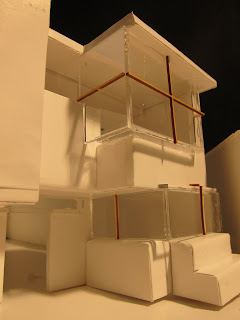
Darwin's Wall Assignment
For my design I wanted to stay practical and realistically feasible. I modeled in SketchUp and had an an intention of using "interlocking spaces" as my primary theme in the sense that two walls could be pushed together to form a cube. However, I found a greater appeal in basically interlocking and protruding shapes (rectilinear shapes) and additive vs. subrative. I also wanted to incorporate "skeletal vs. mass" in my design. I divided the facade into a 8x5 grid, which conveniently made 4x4 squares. The protrusions are by one foot, which is the smallest increment used.
I wanted the wall to be very interactive, which accounts the many habitable spaces. There are two upstairs and two downstairs. The one downstairs closest to the park has benches while the other is a standing, both with views of the courtyard. Upstairs, the balcony gives a great view of the park and courtyard. On the right is a more isolated room which can be separated by a screen to give a private zen view of the courtyard. The room can be reached by the exterior and interior balcony. I envisioned the stairway to be on the outdoor balcony side to further isolate the zen room.
The inside trees can be touched by those on the inside balcony, which could create a corridor effect to the zen room, for a more private feel. The last habitable space is the benches attached to the outside of the wall. One wraps around the park-side corner and the other is an extension on the opposite side of the wall. As for material, concrete for the structure would be most suitable, since I picture huge rectilinear shapes jutting out to form a wall.
Corners of the shapes are exposed to solidify the motif. Also, I placed a large vertical monolith to offset the number of vertical elements on the wall. I kept the entrance more symmetrical for an orderly feel. The glass surrounding the entrance makes it more visible from both courtyard entrances. Overall I was pleased with the final product.
Wednesday, February 24, 2010
Monday, February 22, 2010
"Gravity and Light," Mario Botta
Note a book in Art Library called "Gravity and Light" by Botta is a great resource. Excerpts from an article on New Sacred Space includes quotes by Botta. Botta suggests that sacred space can occur in buildings that are not churches- such as his museums- so how does he envision SFMOMA sacred? You can read his thoughts on that at: http://www.ArchitectureWeek.com/2007/0509/culture_1-1.html
"In a society which is inattentive to the values of the spirit, there is instead a great need for spirituality," Botta says. "It's a strong but very personal need." He uses very little iconography in deference to the individuality of this need. Instead, he creates spaces conducive to contemplation and silence using light, geometric forms, and natural materials …
…according to Botta. "A new church is a place of sustenance, silence, and prayer which through its architecture reaffirms the authentic human values," he says. "It is a structure that goes beyond the religious meaning that generated it, in order to bear witness — for believers and nonbelievers alike — to a primary, ancestral, and profoundly human need."
… sacred spaces are often defined by common characteristics: 1) a portal or threshold symbolizing a passage into a separate world; 2) a path, perhaps meandering, perhaps labyrinthine, inviting exploration and discovery; and, 3) a destination or focal point
(Source: Debra Moffit, “New Sacred Space,”Architecture Week, May 2007.)
{certainly the restoration of the mind and the spirit is a key human need}
-Patti
Sunday, February 21, 2010
some of my design considerations...
I am quite worried what makes (not so traditional Christian) sacred architecture sacred, so I did a couple of research and here's some ideas to consider (one way to look at it):
"the more positive and impressive the architecture, the more it is culturally impregnated, the more it inhibits new thinking"
"liturgy becomes pure theatre and magic when it is enacted upon such a fantastic and dreamlike stage set"
"the most eloquent worship space may, in the long run, be that which at first appears to say very little." the "system of forces," expressed with subtlety and understatement, should be recognized or become obvious after habituation, revealing assets slowly, and the mind being drawn to its form and beauty.
-basically, simplicity is the safest way to go, in order to avoid digression from the message/focus. this also avoids setting messages or preaching "sermons in stone." The circulation paths should reveal slowly the beauty and assets of the building/chapel and its message or mood.
Bearing that this is a non-denominational church, it warns that the complexities would confuse and complicated symbol-systems (like the stations of the cross) would speak loud, gearing towards a narrower thinking. But of course, there are ways to avoid these without being too simple or cliche of sacred architecture (the author also mentions how very efficient a box form is - and I actually notice this in most of the modern church plans I've looked at).
At least this is my short interpretation of a couple of chapters (Third Millennium Churches by Peter Smith), some of which are difficult to summarize.
This research (still going) impacts my design thinking, which is why i initially started using box forms to keep at simplest and manipulate from there, to see how much i am becoming too complex. My design goal is ultimately to keep the forms simple, at the same time adding minimal manipulations, accommodating secular and religious activities, zen views, utilizing the ocean view but not making it too important,, and keeping an enlightening/de-stressing mood.
Some of the author's good points or additional considerations
for the chapel area:
-the chair arrangement (people) should be in close vicinity of the speaker (for visual and auditory contact). An arc around the speaker is a good area, rather than longitudinal, because its shape produces a more coherent idea of a congregation/group, the symbolic system becomes more about fellowship/family.
-a focal point would give coherence to the whole space, it being the pivot.
-corners enable the mind to locate position and dimensions
- a single space should be maintained
-light should not be in high proportion to avoid glare eye strains. Definitely, do not place the minister behind a large window/curtain wall as the sharp contrast would darken him.
-"simplicity and uniformity in wall finish" is desirable
Saturday, February 20, 2010
Process: Site Plans
Below are the two site plans I'm considering:
The one above has been the design I've stuck with for a long time, and I feel it's more effective in perspective (3D) than in plan. Below is my newly considered site plan. Though I was originally reticent to change things, I feel like there's more order to this building placement, and between the 3 key structures, more interaction.
Contrary to the picture in the previous post, I decided to have the classroom, chapel, and side chapel all look out at different angles (each 7.5 degrees different b/c that was the proportional grid system I've been working with). I feel that this is a strong gesture in plan, but I'll have to wait until I model it to see how helpful it is in reality. Some problems to resolve with this design:
1) There seems to be an awkward interaction between the southeast corner of the Chapel and Northeast corner of the classroom.
2) The northeast corner of the church feels very "sharp". Not sure how to make this feel like less of a point, how to give it more mass?
3) "The wall" feels extremely long now. In the plan above, I tried to solve this by experimenting with the roof of the office, extending it out over the "path" to a triangular island. Not sure how I feel about this; my goal was to frame a zen view from when you enter the complex, and look left towards the ocean, but instead move right to get to the chapel, classroom, etc.
Thoughts?
Viral's Chapel Project
I have had a slow start to the chapel project. I think the freedom of this project has made it relatively difficult for me to come up with a thoughtful design. Since the start of the project, I wanted to have a very structured design, one that would lend itself well to the programatic requirements. In class, when we discusses the Modernist vs Post Modernist styles of architecture, the Modernists resonated most with me. I wanted every nook of my buildings to serve some functional purpose. Instead of a cluster of buildings, I wanted a strong organizational structure that the rooms or buildings would sit within. For this reason, I started off with a rectangle from which I carved out rooms. When doing this, I realized that I was really intrigued by the idea of creating a long walkway or corridor from which occupants would enter the chapel. This would allow the occupants to undergo an experience before reaching the chapel. This, combined with with my desire to have an organized cluster of buildings lead me to explore several variations seen below.
The design that I produced takes components from each of my trial models. I have two separate structures, one housing the classrooms and the office upstairs, and the other housing the chapel. Both structures are connected by an elegant raised walkway that allows the occupants the experience the grandeur of the chapel. My chapel is situated in a box within a box. My idea is to have a perforated concrete chapel surrounded by a glass box that would 1. allow for protection from the weather 2. while also allowing in ample sunlight 3. and gorgeous views. The chapel and lobby/classroom/office structure all fit within an overall rectangle, best seen in plan view or from one of the sides. Also, I wanted to create an entry way to the chapel that would block the street noise, and infrastructure. For that reason, occupants will enter the lobby area and then proceed onwards to the chapel by following the path in front. When past the lobby, that structure will shield the occupants from the street and give them a sense that they have entered a completely differ't space.
My design will stay simple and respect the geometry of the structures. My hope is that by creating a simple and refined structure, I will be able to evoke a sense of peace and calm. My next few steps will be to really thing through some of the details of the structure. I need to think of what the envelope will look like, what the inside of the chapel will be etc.
Friday, February 19, 2010
Chapel Process
I made my study model and massing model out of cardboard and paper. I wanted to explore the idea of having the main chapel actually be on the roof. I do not like the intimidating atmosphere of a normal chapel in which you have really high ceilings and the chapel is really dark. It makes the congregation feel small and insignificant. With my chapel, I really wanted to try to celebrate the individual.
I also wanted to look into making my chapel look like a ship, since the site is by the ocean. I made two clear-story type windows at the ends to mimic the bow and stern. I also decided to make the roof structure over the roof top chapel area resemble the sails of a sailboat.
Subscribe to:
Posts (Atom)