


Here are some more pictures of the final project.
 ame up with. I would say the main influence in the design of the project was Tadao Ando and his projects The Benesse House, Chichu Museum, and Church if the Light.
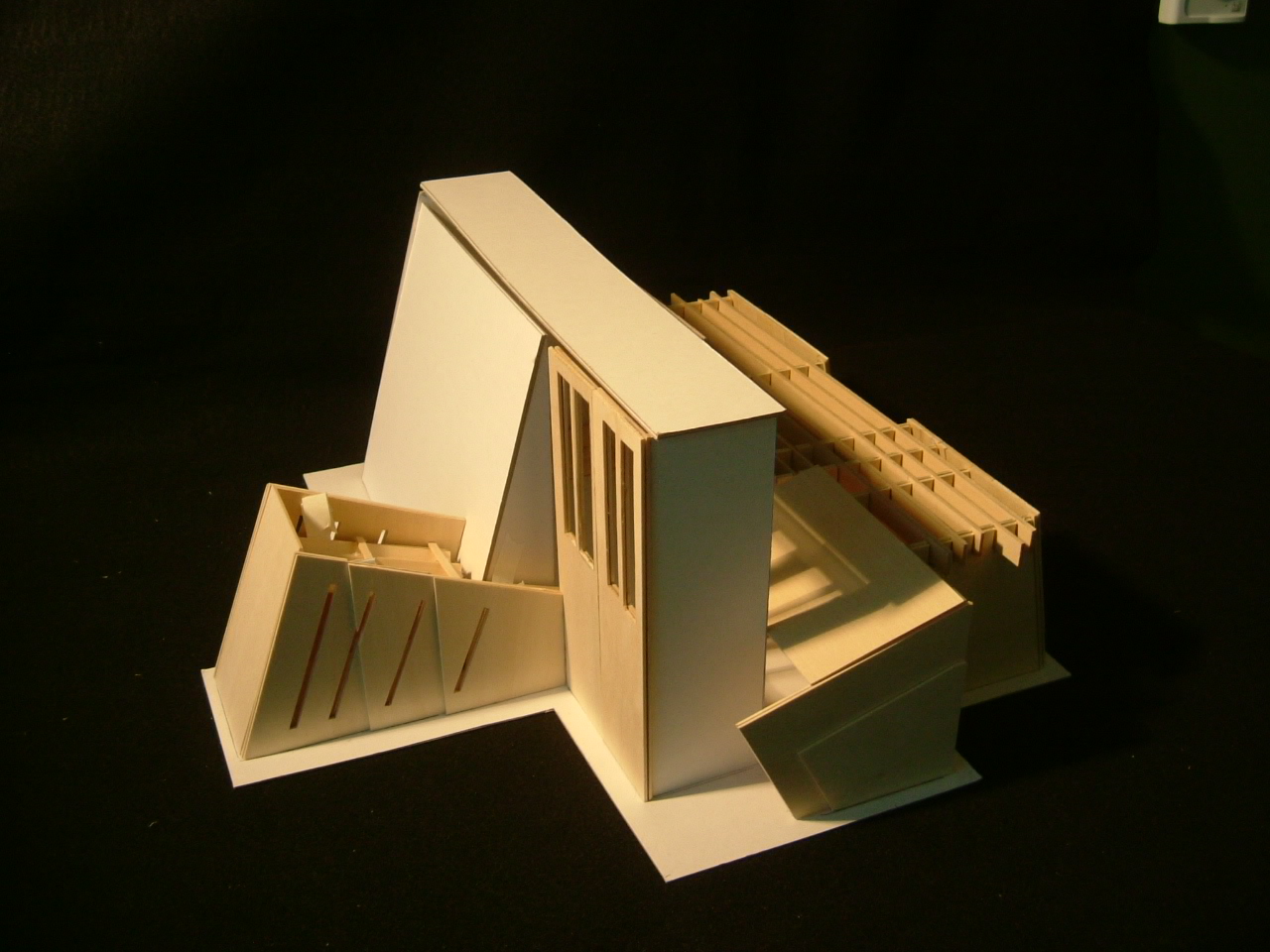
 At the end of the chapel in the stage area, there is a beloved detail. There are three slender windows in diagonals that together make a triangle. This represents the Holy Trinity that is part of the congregation's belief.
  Each window represents one of the entities: The Father, The Son, and The Spirit, which together form one body in which the congregation puts its faith on. Since there is a line of trees behind the main chapel, perhaps some of the trees would be visible to the pastor or people on stage from these windows.
 east of the main chapel. Here the roof is derived from a Fehn-type system that allows light to enter. The ceiling would be at mid height of the vertical beams that extend over the spaces. This would allow for the beams to be seen from both inside and
  outside of the building. What I really like about this part of the chapel building is that it creates a space for reflection. As one steps outside of the chapel going to the office, there is this sp
 ace with lines of natural light alternating with shadows from the beams. This creates a place for people to calm down, appreciate the trees to the east, and have a sense of privacy before meeting with the pastor or minister in his office.
 On the other side of the door to the office is the Zen View. This is a window/door type opening. The opening is about 4 feet tall from the ground. This opening faces the ocean, so that is what it would be framing. From up close it would be hard for people to see the ocean, but from the main aisle or the other side of the main chapel, the idea is that people would be able to see the ocean. This is the only clearly open space that captures the ocean t
 hroughout the building. So what i had in mind was that people would be drawn to this window and as they got close to it, they would have to sit on the floor and then get the amazing view. For children, they would be able to walk through this opening, and perhaps that would make adults want to crawl or bend down to go through.
 The lobby is at the front, closest to the suggested parking lot. This is also very Tadao Ando like, or at least i think so. There is an opening next to a 30 ft tall wall. The idea was to create this cave-like, maze-like, atmosphere where you want to go in it and see what is inside. Once inside you take a diagonal walk towards the main entrance. this was done to slow down the process of going to the main chapel, and also creates spaces for people to congregate. The solid roof allows for this dramatic opening as one heads towards the main chapel, which kind of adds to this revered and majestic feeling.
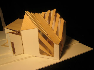
 the striations in many of Botta's designs and Alto's Finland convention center building. The spacing between the windows is each one foot more than the previous spacing going east. This was to add variation
 to the windows. The roof also went to a more complex form from the main chapel flat roof. The roof is a pinos type roof the hangs from the ceiling. I thought lowering the ceiling would add a cool effect as well as a lighting effect from the light coming in through the perimeter of the roof. There is also variation with the front walls of the side chapel. There is sort of additive thickness as one goes east. There is a baptistery fountain that resembles the beloved detail of the triangle that represents the Trinity.
 I think that something i've learned from design this quarter is that it seems you're never really done, and there's always things to work on, even after a project is "done". It's not perfect, and there are things i feel i could change as i'm looking at it right now. It's been a fun project.


 And now...my final chapel:


I enjoyed the chapel project a lot because it gave me the opportunity to develop a design style. Creating the chapel helped me distill my broad, vaguely defined interest in architecture into a specific artistic approach – minimalism.
In designing the chapel, I wanted structural form to follow the building’s functions, so I began by looking at the program. Next I chose a guiding design principle that would be reflected in all my artistic decisions; I decided on threes. Later, Glenn suggested that the threes represent in a subtle, non-obvious way the holy trinity, and the reviewers from San Francisco mentioned that there were elements of both threes and fours, so I implemented the conceptual idea of the four elements into the design as well.
Louis Kahn’s entire body of work (particularly the Trenton Bath House), as well as selected works from Steven Holl, inspired my design. Kahn’s simple, pragmatic designs, straight lines, and symmetry punctuated by significant alterations are all artistic elements that I will continue to emulate in future designs. Holl’s simplicity and juxtaposition of water and light – most notably in his residential work – are additional design elements that inspired the chapel and that will continue to influence my work.
I based the chapel design on threes: I based the site on a three by three grid; doors are three feet wide; windows and the light element in the roof of the chapel ceiling are slits of three; the beloved detail, the beloved detail is three structural rods at door height emanating from the center of the lobby and continuing through the entire structure.
I employed mass & skeletal relationships as my primary design manipulation. The individual buildings of the chapel are all massive steel blocks connected by skeletal structures. I also employed repetition with variety and symmetry as design elements that would follow the function of the chapel. Each building began as a 15’ x 15’ room that I then altered according to its individual function (the zen vista, for example, became a small entry with a massive steel slab extending to the cliff edge). All buildings are the same height (10’) with the exception of the chapel, which at its highest rises to 30’.
Perhaps the best part of the chapel project is its holistic nature – each student is responsible for every aspect of the chapel, but can look to other architects and other students for inspiration (though I suppose this is true for any studio class).

